Here’s the uncomfortable question a lot of CTOs, founders, and product managers keep circling back to: Why are smart, expensive teams spending so much time inside the task tool instead of moving the work forward?
You see it in sprint planning.
You see it in support queues.
You see it when someone opens the backlog and just… stares.
Not because the team is weak.
Not because they do not care.
Because the system is doing a bad job of helping them think.
That sounds soft. It is not.
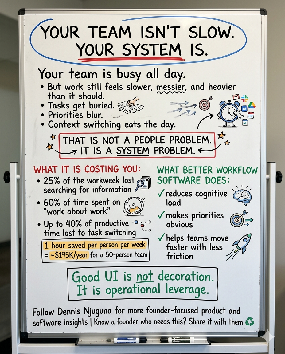
Atlassian’s 2025 State of Teams research found that teams spend more than 25% of the workweek searching for information. 56% of employees still have to ping someone or schedule a meeting to get what they need, and half say teams at their company duplicate work without realizing it. Microsoft’s 2025 Work Trend follow-up found the average worker receives 117 emails and 153 Teams messages per weekday, and that the most overloaded hour of the day is 11 a.m., when meetings, messages, and app-switching collide.
That is the real backdrop for task management software today.
So when a project manager is scrolling through 500 tasks trying to find the right one, that is not a small usability issue. That is part of a larger operating problem: too much information, scattered context, weak prioritization, and interfaces that force people to keep reconstructing what matters.
This is why task management UI design matters more than most teams think. Not because prettier software wins awards.
Because better UI changes how quickly people find work, understand work, sequence work, and finish work.
And yes, that has real financial consequences.
The hidden tax of bad task management software UX
A lot of teams treat friction inside internal tools like background noise. It is not.
If you have a 50-person team with a fully loaded cost of $75 per hour, reclaiming just one hour per employee per week is worth about $195,000 per year. If you use Atlassian’s 2025 benchmark of 25% of the workweek spent searching for information, that same payroll base translates to roughly $1.95 million a year tied up in information hunting alone. No redesign is going to recover all of that, obviously. But even taking a small bite out of that waste changes the economics fast.
And the drag does not stop at search time.
Asana’s 2025 write-up of its Anatomy of Work research says 60% of time at work is spent on “work about work,” not skilled work. It also reports that, over a year, the average knowledge worker spends 103 hours in unnecessary meetings, 209 hours on duplicative work, and 352 hours talking about work. Even more telling, 88% of knowledge workers say time-sensitive projects or large initiatives have fallen behind or through the cracks because of task volume.
That is why this conversation should not be framed as “should we polish the interface?”
The better question is: How much operational drag is your current interface creating every single day?
Why your backlog feels heavier than it should
One reason task management tools become exhausting is simple: they ask the brain to do too much at once.
Modern working-memory research often places effective capacity at roughly four items held concurrently, not the old “I can handle anything” fantasy teams build dashboards around. Nielsen Norman Group’s guidance is consistent with that: interfaces should reduce cognitive load, support recognition rather than recall, and use progressive disclosure so users only see what they need now, not everything the system knows.
That matters because knowledge work today is already fragmented. Gloria Mark’s research, summarized by UC Irvine, reports that people spend an average of only 47 seconds on one screen before shifting attention, and that it can take up to 25 minutes to return to a task after an interruption. The American Psychological Association has also noted that switching between tasks can cost as much as 40% of productive time.
So when your interface dumps hundreds of items into one endless view, hides the most useful controls, and forces users to remember filters, statuses, and ownership from memory, it is fighting the way people actually work.
That is not a discipline problem.
That is a design problem.
What good task management UI design actually does
Good internal software does not just store tasks. It reduces the effort required to move through them.
In practical terms, that means four things:
1) It reduces visible overload
A better task interface does not force users to process the full backlog at once. It breaks work into manageable chunks and makes the current slice understandable immediately.
That is where pagination, segmented views, or other progressive-disclosure patterns earn their keep. Nielsen Norman Group guidance is straightforward: long, complex experiences become easier when you show only what is relevant at each step instead of exposing everything at once.
In the task management interface I built, this meant showing a focused subset of records at a time, with clear page state, total counts, and predictable navigation. Not because pagination is trendy. Because teams do better when the interface stops yelling all the information at once.
The lesson is bigger than pagination itself: You do not improve productivity by showing more. You improve it by making the next decision easier.
2) It helps users recognize, not remember
A lot of bad task tools make people reconstruct context from scratch.
Which tasks are pending?
Which ones belong to this owner?
Which items contain the keyword I need?
Why am I only seeing these results?
That is wasted cognition.
NN/g’s “recognition rather than recall” principle says interfaces should keep options and information visible or easily retrievable, because recognition is easier than memory retrieval. Their guidance also stresses that visible system status builds trust and helps people decide what to do next. (Nielsen Norman Group)
That is why strong filtering matters more than teams often admit.
Not decorative filters.
Useful ones.
For a task management UI, that usually means a combination of:
- status filters
- owner or assignee filters
- search
- visible active-filter states
- easy reset controls
When those work together, users stop hunting and start narrowing. The interface stops being a filing cabinet and starts acting like a decision-support tool.
3) It makes prioritization feel direct
Some tasks are naturally list-based. Prioritization is not.
Priority is spatial. It is comparative. It is often easier to move than to describe.
That is why drag-and-drop can be valuable in task management UI design when it maps to a real user need. NN/g notes that direct manipulation and visible actions reduce recall demands because users can act on what they see instead of remembering commands or hidden rules. (Nielsen Norman Group)
In this project, drag-and-drop was not there to make the product feel modern. It was there because people regularly need to reorder what matters first.
That is a crucial distinction.
A lot of product teams add advanced interactions as a feature theater.
Good teams add them when those interactions reduce mental translation.
The test is simple: Does this interaction help the user think less and act faster?
If yes, keep it.
If not, it is decoration.
4) It gives constant feedback
Internal tools feel exhausting when users cannot tell what changed, what is selected, what filtered the results, whether an action worked, or what happens next.
That is why visual hierarchy and immediate feedback are not cosmetic polish. They are operational safeguards.
NN/g’s heuristics emphasize visibility of system status, immediate feedback, consistency, and minimalist design. Every extra unit of irrelevant information competes with what matters most. (Nielsen Norman Group)
In a task management interface, that means things like:
- obvious current page state
- clear task status badges
- visible drag state and drop targets
- active filter chips
- empty states that explain what happened
- consistent labels, layout, and controls
These are small design choices individually.
Together, they determine whether the tool feels clear or tiring.
The real business value of thoughtful workflow UI
This is where a lot of teams undersell the problem.
They assume UI improvements are marginal.
But better internal UX compounds because it improves repeated behavior. A public landing page might be visited once. A task tool gets used all day, every day, by your highest-cost people.
McKinsey estimated years ago that the average interaction worker spends nearly 20% of the workweek looking for internal information or tracking down colleagues, and argued that better knowledge-sharing systems could raise productivity by 20% to 25%. What is striking is not that this number was high in 2012. It is that newer workplace research suggests the problem is still here, and in some environments may be worse. (McKinsey & Company)
Atlassian’s research also shows that teams with clear processes are 4.6x more likely to be productive, and that teams with consistent planning and tracking practices collaborate more effectively. (Atlassian)
That is why better task management UI design creates value in at least four ways:
- It cuts search time.
- It reduces duplicate work.
- It sharpens prioritization.
- It lowers coordination overhead.
In other words, it helps teams spend more time doing the actual work they were hired to do.
What this looks like in the real world
This kind of design work is especially high-leverage in teams where volume and ambiguity collide.
A support team benefits when urgent tickets can be surfaced quickly, filtered by owner or status, and reordered without ceremony.
A product team benefits when backlog views stop feeling like a landfill and start feeling like an argument for what matters now.
A PMO benefits when dependencies, ownership, and status are visible enough that meetings stop becoming archaeology.
A sales ops team benefits when leads do not disappear into workflow gaps, and handoffs are obvious.
An engineering team benefits when grooming is no longer an endurance sport.
Different departments.
Same root problem.
Too much friction between “what needs doing” and “what happens next.”
What to measure after you ship
If you want to prove the value of a redesign, do not stop at stakeholder approval or “looks better now.”
Measure the behavior change.
For a task management UI, I would track:
- time to locate a task
- time to reprioritize a list
- filter usage rate
- search success rate
- number of duplicate tasks created
- completion rate of priority items
- backlog grooming time
- user-reported effort and clarity
That last one matters more than some teams think. If people say the system feels lighter, clearer, and easier to trust, that usually shows up downstream in speed, consistency, and fewer workarounds.
The founder takeaway
If your team is spending too much time organizing work, talking about work, searching for work, or reconstructing the meaning of work, you do not have a tool adoption problem.
You probably have a workflow design problem.
And that is fixable.
A stronger task management UI will not magically save a broken org. But it will remove a surprising amount of daily friction from teams that are otherwise capable, motivated, and ready to move.
That is the kind of leverage founders should care about.
Because the software your team runs on matters just as much as the software you sell.
Share this article
Send it to someone who would find it useful.