Most founders do not discover a data table problem in Figma.
They discover it when a team quietly starts exporting product data to Excel every day.
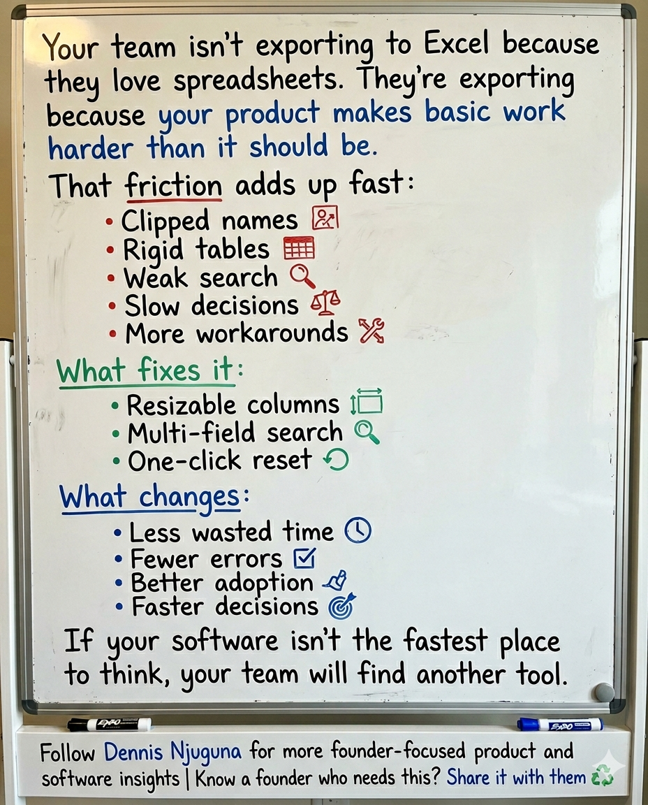
Not because they love spreadsheets.
Because Excel is easier than your interface.
That is the real spreadsheet problem.
It is not about aesthetics. It is not about whether a table looks “clean.” It is about whether your software helps people make decisions quickly or forces them to fight the screen before they can do their job.
And that gets expensive fast.
Take a simple example. In a 100-person team, if each person loses just 15 minutes a day wrestling with a rigid table or hunting for basic information, and their fully loaded cost is $50 an hour, that is about $312,500 a year in wasted time.
That number is not dramatic. It is conservative.
The broader research points in the same direction. Microsoft found that 62% of people say they struggle with too much time spent searching for information during the workday, and that the average employee spends 57% of their time communicating and only 43% creating. Asana reports that knowledge workers now spend 60% of their time on “work about work” such as chasing updates, searching for information, switching between apps, and tracking status. In Slack’s 2024 Workforce Lab research, desk workers said 41% of their time goes to low-value, repetitive tasks.
That is why this matters to founders.
When your software creates friction around data, the cost does not stay inside the product team. It spills into support, sales, ops, finance, and leadership. It slows the work that compounds growth.
And the pressure is only rising. Microsoft’s 2025 Work Trend Index found a widening capacity gap: 53% of leaders say productivity must increase, while 80% of the global workforce says they lack the time or energy to do their work.
So no, this is not “just a UI issue.”
It is an operating issue.
Why teams export to Excel in the first place
Here is the uncomfortable truth: most users do not leave your product for a spreadsheet because the spreadsheet is more powerful.
They leave because the spreadsheet is more forgiving.
A spreadsheet lets them widen the column that matters.
Hide the noise.
Scan the signal.
Search the way they think.
Recover from a mistake in one move.
In other words, it adapts to the task in front of them.
A lot of B2B products do not.
Nielsen Norman Group’s guidance on workplace tables is blunt: data tables need to support four core jobs well. People use them to find records that match criteria, compare data, view or edit a row, and take action on records. If your table makes any of those four jobs harder than they should be, users start building workarounds.
That is why fixed-width tables create so much hidden pain.
A support agent does not read a table the same way a sales rep does.
An analyst does not prioritize the same columns as an ops lead.
A founder reviewing churn risk does not care about the same fields as a customer success manager triaging accounts.
But fixed tables assume everyone should look at the same layout in the same way.
That assumption breaks the moment real work begins.
The hidden cost of bad data table UX
Founders usually underestimate this because the friction looks tiny.
A clipped customer name.
A field hidden behind horizontal scrolling.
A search box that only works if the user remembers the exact string.
A layout that becomes unusable after one accidental drag.
Each one feels minor in isolation.
Together, they create drag.
And drag compounds.
Microsoft’s own telemetry shows how fragile modern focus already is: employees are interrupted every two minutes during core work hours by meetings, emails, or pings. In that environment, every extra click, every avoidable scan, and every broken search experience matters more, not less.
That is why the spreadsheet workaround is so revealing.
It is not just a workaround. It is a vote.
A vote that says: “Your product is not the fastest place to think.”
For a founder, that should set off alarms.
Because if users do not trust the product as the best surface for working with data, they will not only export it. They will also make slower decisions, introduce more manual errors raise more internal support tickets, and depend more heavily on tribal knowledge.
That is how “small UX issues” become margin issues.
What better data table UX actually looks like
The fix is not complicated in theory.
The table needs to behave like a work surface, not a screenshot.
In practice, that usually starts with three capabilities.
1) Resizable columns: because context changes
This is the one founders often dismiss as a nice-to-have.
It is not.
Resizable columns give users control over what deserves space right now.
That matters because horizontal scrolling remains a known usability problem. Nielsen Norman Group explicitly advises teams to avoid horizontal scrolling on web pages and minimize it elsewhere, noting that users consistently react negatively to it.
That means a support agent should be able to widen “Customer Name” and “Issue Summary” without permanently breaking the table for everyone else.
A sales rep should be able to expand “Company” and “Deal Value” before a pipeline review.
An ops lead should be able to compress low-value columns and elevate exception data.
The core idea is simple: different roles need different visual priorities, even when they are looking at the same data model.
And when the interface reflects that, it stops feeling rigid and starts feeling useful.
2) Multi-field search: because people do not remember data the way databases do
Most weak table search behaves like a backend engineer designed it for themselves.
One field.
One format.
One correct input.
Real users do not think that way.
They remember fragments. A first name. A status. A company. A ticket tag. A partial account name. Sometimes just a clue.
That is why forgiving search is such a force multiplier.
Baymard’s 2024 search benchmark found that 41% of sites fail to fully support key search query types, and that weak search leads to wasted time refining queries and task abandonment. Baymard studies e-commerce, but the behavioral lesson carries cleanly into SaaS and internal tools: when search only works for exact phrasing, users do more of the system’s work themselves.
Inside a B2B product, that means your table search should usually work across the fields users are most likely to think in, not just the field that engineering finds easiest to query.
This is not about convenience.
It is about compressing the distance between question and answer.
3) One-click reset: because control matters more than perfection
Users do not just need flexibility.
They need safety.
Nielsen Norman Group’s usability guidance on user control and freedom says users make mistakes, change their minds, and need a clearly marked way to leave an unwanted state. More than that, easy recovery encourages exploration and increases overall use.
That is the overlooked reason a reset button matters.
Without a reset, customization feels risky.
With a reset, customization feels reversible.
That changes behavior.
People experiment more.
They personalize the interface faster.
They trust the product more because they know they cannot permanently mess it up.
It is a tiny control with outsized psychological leverage.
Visual polish helps, but it will not save a broken workflow
A polished interface absolutely matters.
But not in the way many teams think.
Nielsen Norman Group’s 2024 guidance on the aesthetic-usability effect explains that people often perceive attractive products as more usable and are more forgiving of minor usability flaws when the design feels visually strong. But that forgiveness has limits: a beautiful interface cannot cover for major workflow problems for long.
This is exactly what happens with many “beautiful” dashboards.
They demo well.
They screenshot well.
They impress stakeholders.
And then real users hit clipped names, poor search, and rigid layouts.
At that point, the glow wears off.
So yes, visual quality matters. It improves trust and lowers perceived friction.
But if the table cannot support the work, beauty becomes camouflage.
Why this is a founder problem, not just a UX problem
The fastest way to underestimate design is to treat it like decoration.
The smartest founders do the opposite. They treat it like leverage.
McKinsey’s research on the business value of design found that companies in the top quartile of the McKinsey Design Index outperformed peers by 32 percentage points in revenue growth and 56 percentage points in total returns to shareholders over five years.
That does not mean “make things prettier, and revenue rises.”
It means companies that design around real user behavior tend to build better systems, remove more friction, and convert product quality into business performance more reliably.
Data table UX sits right in that lane.
Because tables are where high-value work often happens in B2B software:
⤷ Support teams triage accounts there.
⤷ Sales teams qualify and prioritize there.
⤷ Ops teams reconcile exceptions there.
⤷ Analysts look for patterns there.
⤷ Leaders make decisions there.
If that surface is clumsy, the cost repeats across every workflow that touches it.
And if the surface is fast, flexible, and trustworthy, the gains repeat too.
That is why founders should stop asking, “Is this table good enough?”
A better question is: “Is this the fastest interface we can give the team for making decisions?”
How to estimate the ROI of fixing your table
You do not need a giant transformation program to justify this work.
Start with a simple model: Employees using the table × minutes lost per day × loaded hourly rate × working days per year
That gets you to a rough annual cost quickly.
Then measure the operational indicators that tell you whether the interface is getting better:
- time to find a record
- successful searches on first try
- export-to-Excel frequency
- average handling time
- support tickets about the tool itself
- repeat usage and saved views
- error rates caused by misreading or missed context
This is where founders often get stuck.
They want a perfect ROI model before they act.
You do not need perfect precision.
You need enough evidence to see whether the product is helping people work through the system or teaching them to work around it.
What a production-grade data table usually needs
If you are building or rebuilding this properly, think beyond the three visible features.
A production-grade table usually includes:
- resizable columns with sane min and max widths
- multi-field search tuned to how users actually recall data
- sticky headers for scanability
- responsive behavior that minimizes horizontal scroll
- one-click reset to the default state
- saved views for repeat workflows
- keyboard accessibility
- performance safeguards for large datasets
- analytics around search failures, exports, and usage patterns
That last point matters.
If your users keep exporting, zero-result searching, or abandoning filters, the table is telling you where the product friction lives.
Listen to it.
The real lesson behind the spreadsheet problem
Here is the founder-level takeaway.
When users export to Excel, they are not being difficult.
They are giving you product feedback in the clearest possible form.
They are telling you your software is not yet the best environment for doing the work.
That is not a training problem.
It is not a “change management” problem.
And it is definitely not a user problem.
It is a design and systems problem.
The good news is that these are fixable problems.
And they are often cheaper to fix than founders expect, especially compared with the ongoing cost of wasted time, avoidable errors, and slow decisions.
If your team is still exporting data into spreadsheets just to make your product usable, that is usually the signal that the software needs to be rethought at the workflow level, not just patched at the UI level.
Share this article
Send it to someone who would find it useful.