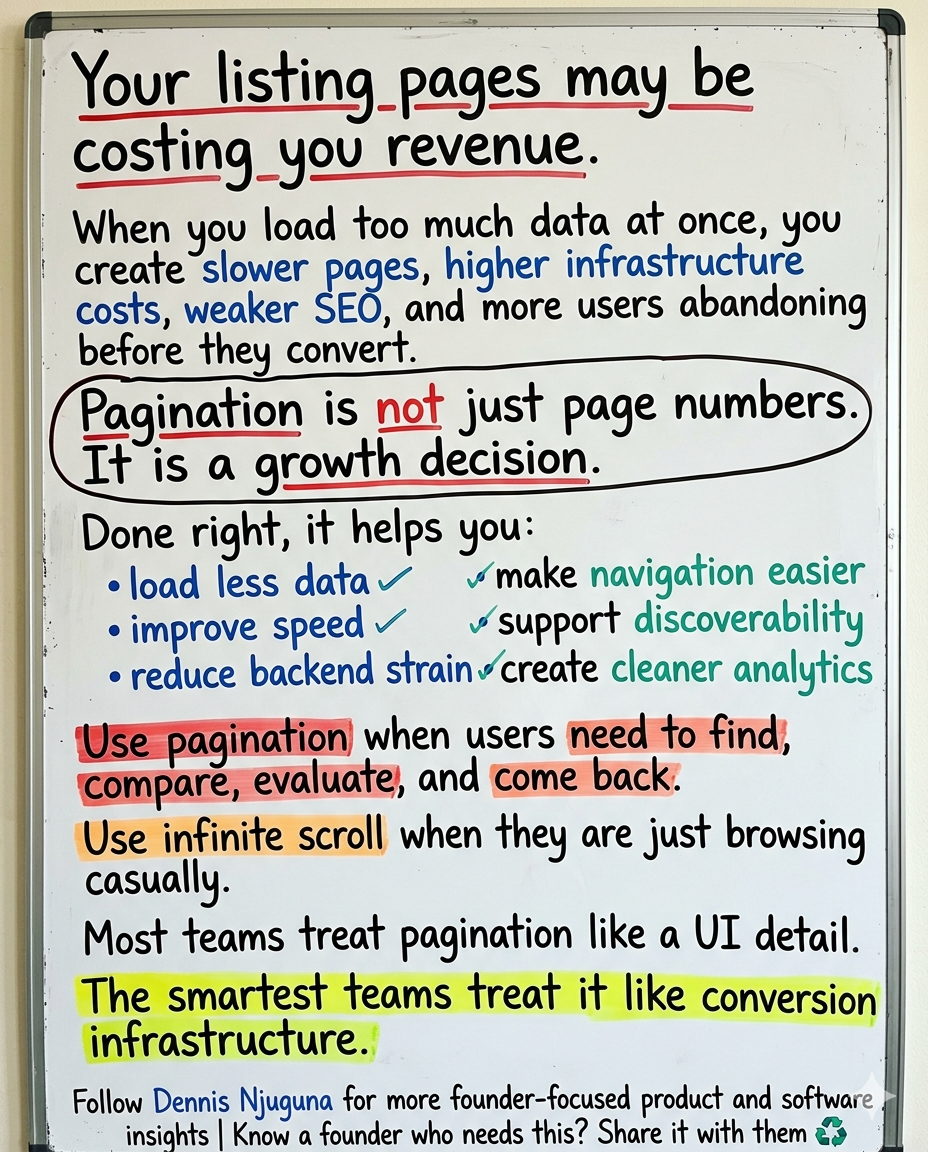
Your listing pages may be costing you more than you think.
Not because the design is ugly.
Not because your filters are broken.
Not because users hate your product.
Because you are asking one page to do too much.
Google still cites a brutal benchmark: 53% of mobile visits are likely to be abandoned if a page takes longer than 3 seconds to load. Google’s benchmark research also found that as mobile load time rises from 1 second to 10 seconds, bounce probability increases 123%, and as the number of page elements grows from 400 to 6,000, conversion probability drops 95%. Deloitte’s widely cited “Milliseconds Make Millions” study adds the business case: in its sample, a 0.1-second natural improvement in mobile speed correlated with an 8.4% lift in retail conversions.
That is why pagination matters.
Not as a cosmetic pattern.
Not as “page numbers.”
Not as a front-end detail someone can tidy up later.
Pagination is one of the clearest ways to turn a heavy, chaotic listing experience into a faster, more navigable, more measurable flow.
And when you run an ecommerce catalog, media archive, SaaS dashboard, or data-heavy application, that shift can have a direct effect on conversion, discoverability, infrastructure efficiency, and user trust.
What problem does pagination actually solve?
At its core, pagination solves the “too much at once” problem.
When you dump hundreds or thousands of records into a single page, you increase rendering work, make the interface harder to navigate, muddy your analytics, and make crawlable discovery harder to manage. Google’s current ecommerce documentation explicitly frames the tradeoff this way: showing a subset of results can improve page performance and user experience, but you have to implement it so Google can still discover the full collection.
That is the real business value of pagination.
It lets you keep the experience lean without sacrificing findability.
Why overloaded listing pages underperform
I see this mistake constantly: a team ships a listing page that works fine in development, then usage grows and the page quietly starts fighting the business.
The page gets heavier.
Interaction gets slower.
The product feels less predictable.
Users abandon tasks instead of completing them.
Google’s mobile benchmark research is still one of the clearest warnings here. In its analysis of 11 million mobile landing pages across 213 countries, Google reported that 70% of pages took more than 5 seconds to show above-the-fold visual content, while the majority of mobile sites were still “slow and bloated with too many elements.”
That is not just a performance issue.
It is a conversion issue.
Because, overloaded pages do not merely slow down. They reduce confidence. They create hesitation. They make the experience feel less trustworthy, less controllable, and less worth continuing.
Why pagination affects revenue, not just rendering
The teams that win with pagination understand something simple: Users do not experience your architecture. They experience the consequences of it.
A lighter first page means less data transferred, fewer DOM nodes to render, less layout work, fewer images competing for bandwidth, and a clearer path to action. The business effect is not theoretical. Google’s research ties slower load times to abandonment, while Deloitte’s speed study ties even a 0.1 second improvement to measurable movement in conversion and engagement metrics.
That is why I push founders and product teams to stop treating listing-page architecture like a low-priority implementation detail.
If your users browse products, compare options, search records, or return to prior results, pagination is part of your revenue system.
Pagination best practices for performance
If you want pagination to improve performance in a meaningful way, do not stop at splitting a long list into numbered pages.
Build it as a performance feature.
That usually means:
- loading only the records needed for the current page
- keeping page sizes sensible
- lazy-loading below-the-fold assets
- preserving stable card and table layouts
- prefetching the next page carefully when it helps the experience
The key principle is simple: fetch what the user needs now, not everything they might need later.
That reduces transfer size, lowers rendering pressure, and keeps the UI feeling responsive. Google’s mobile benchmarks reinforce the direction of travel here: faster pages and fewer elements are strongly associated with better outcomes.
Pagination best practices for SEO
A lot of SEO advice around pagination is outdated.
Google’s current documentation is much clearer than older blog posts and checklists. For paginated content, Google recommends sequential <a href> links between pages, a unique URL for each page such as ?page=n, and a self-canonical for each page in the sequence rather than canonicalizing everything to page one. Google also says not to use fragment identifiers like #page=2, because Google ignores fragments for this purpose. And importantly, Google’s current doc explicitly states that it no longer uses rel="next" and rel="prev" to understand pagination relationships.
That matters because public-facing content still gets this wrong all the time.
Another important point from Google: when crawling paginated or incrementally loaded content, Google generally follows URLs it finds in the href attribute of <a> elements. Its crawlers do not “click” buttons and generally do not trigger JavaScript that requires user action to reveal more content.
So if your pagination only works through buttons or JS-only state changes, your users may be able to navigate it while search engines struggle to discover it properly.
That is not a minor technical edge case. That is a discoverability problem.
A clean SEO-friendly pagination pattern
For public content, your URL structure should look more like this:
/category/widgets?page=1
/category/widgets?page=2
/category/widgets?page=3
Not this:
/category/widgets#page=2And not a JS-only experience where the next set of results appears only after a click handler mutates the page.
If you care about organic discovery, give every page in the sequence a crawlable URL and real links between them. That is Google’s current guidance.
Pagination vs infinite scroll: which one converts better?
This is where teams often get distracted by trendiness.
Infinite scroll can feel smoother. It can look more modern. It can keep people moving.
But that does not mean it is the right choice for every product.
Nielsen Norman Group’s guidance is clear: infinite scrolling can lower interaction cost for long lists of similar items, but it is less suited for specific tasks such as finding a particular item. Baymard’s ecommerce research points to the same problem from a different angle: with endless scrolling, refinding items in a product list can become severe, because users can quickly load a large number of products and then struggle to return to where they were.
This is the decision framework I recommend:
- Use pagination when users need to find, compare, evaluate, and return.
- Use infinite scroll when users are browsing passively or consuming a feed.
If your users are shopping, reviewing search results, scanning records, or working through an admin queue, pagination usually gives them better orientation.
And orientation matters more than most teams admit.
Why pagination is a strong fit for ecommerce, publishing, SaaS, and data-heavy apps
1) Ecommerce product catalogs
Shoppers compare. They backtrack. They revisit. They share links. They narrow down.
Pagination supports all of that. Baymard’s research on product lists highlights the refinding penalty of endless scrolling, while Nielsen Norman Group notes that infinite scroll is weaker for specific finding tasks.
That makes pagination a strong fit for category pages, search results, and filtered product collections.
2) Content publishers and media archives
Archives need structure.
Readers exploring a category, tag, or year-based archive benefit from a predictable sense of place. Search engines benefit too when archive pages are split into crawlable, unique URLs rather than hidden behind interaction-heavy loading patterns. Google’s current pagination guidance is directly relevant here.
3) SaaS dashboards and admin panels
Power users care less about “slick” and more about control.
They want predictable navigation, stable interfaces, and task completion that does not fight them. Pagination helps by keeping the page bounded, making depth measurable, and reducing the need to reload or rerender massive result sets.
4) Data-heavy internal tools and APIs
When datasets are large, bounded requests become a feature in their own right.
Pagination lets you fetch the minimum viable payload, retry one slice instead of everything, and analyze task performance by page depth rather than treating all browsing behavior as one unstructured blob.
Accessibility is not optional here
Pagination is also an accessibility decision.
And this is where many teams still underinvest.
World Health Organization estimates that 1.3 billion people, about 1 in 6 globally, live with significant disability. At the same time, WebAIM’s 2025 Million report found that 94.8% of homepages had detectable WCAG 2 failures.
That gap matters.
If your pagination pattern is unclear, mouse-dependent, or poorly announced to assistive technologies, you are not just making the interface harder to use. You are excluding users from completing tasks they were ready to complete.
The good news is that accessible pagination is not mysterious. W3C’s design system recommends giving pagination navigation a unique accessible name and marking the current page with aria-current="page". MDN says the same thing explicitly: when a pagination link is styled as the current page, it should use aria-current="page" so assistive technology can convey that state correctly. USWDS guidance also emphasizes showing the last page, highlighting the current page, keeping first/previous/next available, and using ellipses to indicate hidden pages.
A practical, accessible pagination component should:
- use a
<nav>landmark with a clear accessible label - expose pages as links when the pages are URL-addressable
- mark the current page with
aria-current="page" - keep the current location visually obvious
- support keyboard navigation
- avoid wrapping controls across multiple lines when possible
One more nuance worth keeping: U.S. Web Design System (USWDS) also notes that component patterns should still be tested in the context of your own product, not assumed compliant just because the pattern looks good in isolation.
That is the right mindset.
Accessibility is not a badge you paste on later. It is part of how the component is designed, implemented, and tested.
What good production-grade pagination looks like
A production-ready pagination system usually has a few traits in common:
1. It separates data fetching from UI controls
The pagination component should not own your entire data lifecycle.
Its job is to represent state and let users move through it cleanly. Your container or page layer should handle the query, loading state, caching, and analytics.
2. It supports both UX and crawlability
If the content is public, use URL-addressable pages with real links.
If the content is app-like and private, buttons may be fine.
The pattern should match the context.
3. It preserves orientation
Users should always know:
- where they are
- how many pages exist
- how to move backward and forward
- how to jump out of the middle without getting lost
That is why first, previous, next, last, and ellipsis patterns are still so useful.
4. It is measurable
If you are not tracking pagination behavior, you are guessing.
At minimum, track:
- page depth reached
- next/previous usage
- exit rate by page number
- filter + page combinations
- conversion rate by page depth
- items-per-page experiments
That turns pagination from a static control into a measurable part of the funnel.
The metrics that tell you whether pagination is working
For performance reporting, use modern user-centric metrics, not vanity timing numbers.
web.dev’s↗ current Core Web Vitals thresholds define “good” performance as:
- LCP: 2.5 seconds or less
- INP: 200 milliseconds or less
- CLS: 0.1 or less
Well-implemented pagination can support all three:
- fewer items on the page can reduce rendering pressure and improve LCP
- less front-end work can improve responsiveness and support INP
- stable card and table dimensions can reduce layout shift and support CLS
It will not fix every performance issue by itself. But it removes a common structural problem: asking one page to do far more work than the user needs.
Common pagination mistakes to avoid
Here is where teams still trip up:
- treating pagination as only a UI problem
- fetching the full dataset and slicing in the browser for production use
- hiding subsequent pages behind JS-only buttons
- using
#page=2fragments for public content - canonicalizing every page to page one
- making the current page state unclear
- skipping keyboard support and accessibility labeling
- failing to track page-depth behavior in analytics
None of these feel dramatic in isolation.
Together, they quietly damage speed, discoverability, and completion.
The bigger strategic point
Founders often spend serious money improving acquisition while ignoring the quieter product decisions that weaken performance underneath it.
That is backwards.
If your catalog, search results, archive, or dashboard gets slower and harder to use as usage grows, growth itself becomes more expensive.
Pagination is one of those decisions that helps you scale.
Not because it is flashy.
Because it is foundational.
It gives users structure. It gives search engines crawlable paths. It gives your engineering team more control over payload size, rendering pressure, and instrumentation. And it gives the business a better chance to convert the attention it has already worked to earn.
Final takeaway
The best pagination systems do not feel like pagination systems.
They feel fast.
They feel clear.
They feel deliberate.
They feel easy to come back to.
That is the standard.
If your listing pages are getting heavier as usage grows, or your product team is debating pagination versus infinite scroll without grounding the decision in performance, SEO, accessibility, and conversion, that is exactly the kind of problem I help founders solve.
Share this article
Send it to someone who would find it useful.