There’s a moment that almost every product team recognizes.
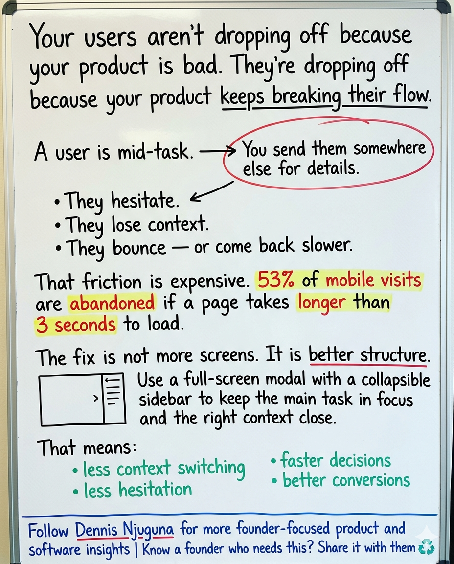
A user is in the middle of doing something that matters — comparing products, configuring a dashboard, editing content, resolving a support issue — and your interface sends them somewhere else “for more details.”
A new page.
A new panel.
A new mental reset.
And right there, the cost shows up.
They hesitate.
They lose context.
They bounce.
Or they come back just annoyed enough to move more slowly.
That is the tax of context switching. And on today’s web, it is expensive.
As of February 2026, mobile accounts for 52.26% of global web traffic, and Google’s long-cited mobile speed research still sets the tone for how unforgiving users are: 53% of mobile visits are abandoned if a page takes longer than 3 seconds to load. Google’s current Core Web Vitals guidance also says an Interaction to Next Paint (INP) of 200 ms or less is the threshold for “good” responsiveness. In other words, performance is no longer just about loading fast. It is about helping the interface feel immediate once the user starts interacting.
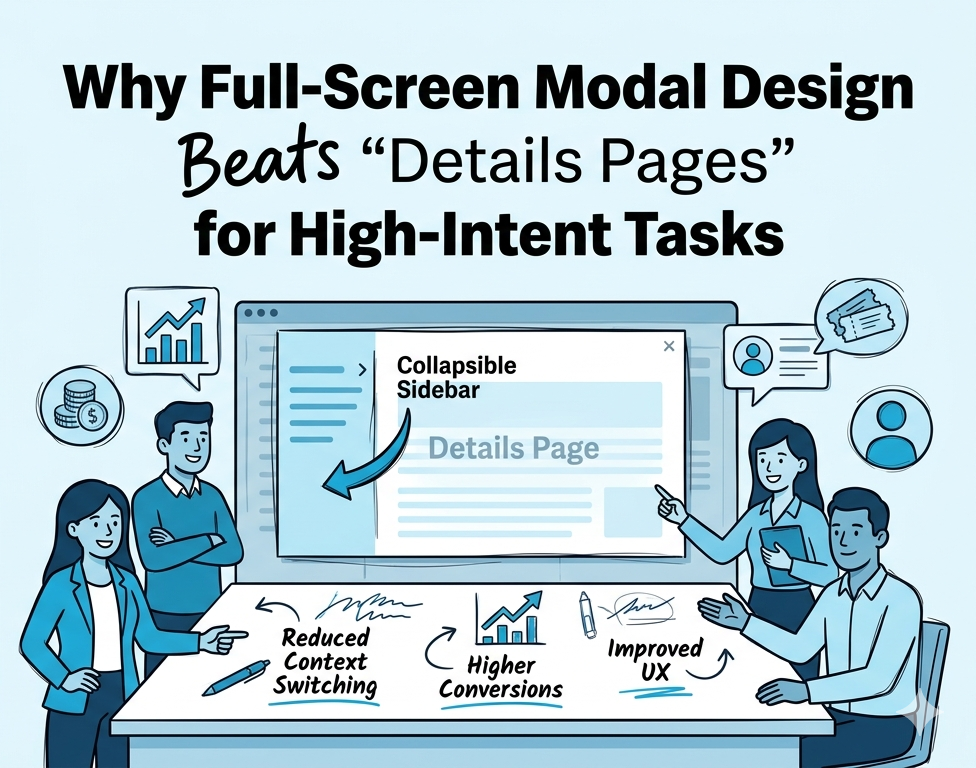
That is exactly where a full-screen modal design can outperform the usual “send them to another page” approach.
Done right, it creates an in-app workspace: the main task stays front and center, and secondary context sits nearby in a collapsible sidebar. The user keeps moving, the product keeps its momentum, and your team stops paying for avoidable friction.
This is not about making the UI feel more “modern.”
It is about reducing unnecessary navigation at the moment users are most likely to convert.
Why context switching hurts more than teams admit
Most product friction is not dramatic.
It is not usually a broken checkout button or a total system outage.
It is smaller than that. More ordinary. More expensive.
It is the extra click to find shipping details.
The hidden filter panel.
The edit screen that forces users away from the content they were just reviewing.
The support flow that dumps them into a new page when they were already close to solving the problem.
Those moments feel harmless when you design them. They do not feel harmless when you compound them across a funnel.
Jakob Nielsen’s classic response-time thresholds remain useful here because they describe human perception, not some outdated framework trend: around 0.1 seconds feels instantaneous, around 1 second still preserves flow, and longer delays become increasingly disruptive to attention. Google’s RAIL guidance sharpens that further for interface motion: animations should ideally be produced in 10 ms per frame or less, even though the theoretical ceiling at 60 fps is about 16 ms, because browsers need part of that budget to render.
That matters because users do not experience your product as a wireframe.
They experience it as a series of micro-decisions:
- “Did that click work?”
- “Why did I leave the page?”
- “Where did the setting go?”
- “Do I really want to keep doing this?”
The more often your interface interrupts flow, the more often users have to think about the interface instead of the task.
And that is where conversions begin to leak.
What full-screen modal design actually solves
At its best, a full-screen modal does one thing extremely well: It keeps the user inside the task while still giving them access to supporting information.
That sounds simple. It is not.
A lot of modal implementations fail because they choose the wrong tradeoff. They either show too little context, forcing users into the familiar open-close-open-close loop, or they cram too much into a cramped overlay and create clutter instead.
A better pattern is closer to a workspace:
- Main panel (roughly 70–100%) for the core task
- Collapsible sidebar (roughly 0–30%) for supporting context such as filters, reviews, metadata, settings, help, logs, or related actions
This is where progressive disclosure becomes useful. Nielsen Norman Group defines progressive disclosure as deferring advanced or rarely needed features, so interfaces stay easier to learn and less error-prone. In practice, that is exactly what a collapsible sidebar does when implemented well: the primary task stays visible, while secondary information is available without becoming visual tax.
That is the real win.
Not “more UI.”
Better sequencing.
The user sees what they need now.
They can pull in more when necessary.
They do not lose their place to get it.
Why this pattern works especially well now
A few shifts make this pattern more relevant than it used to be.
- First, the web is more mobile than many teams still design for. With mobile now representing 52.26% of global web traffic worldwide, interfaces that preserve context within the same view have a stronger case than ever, especially for comparison, configuration, and support tasks that feel fragile on smaller screens.
- Second, responsiveness is being measured more honestly. Google replaced the old “first interaction only” framing with INP, which looks at responsiveness across the visit and treats 200 ms or less as good. A full-screen modal with clean state management, minimal layout shifts, and fast transitions can support that goal better than a chain of route changes and page reloads.
- Third, accessibility debt is still everywhere. WebAIM’s 2025 Million report found that 94.8% of home pages had detectable WCAG failures, with 50,960,288 distinct errors across the sample and an average of 51 detectable errors per page. So when teams say accessibility is a “nice to have,” they are really saying they are comfortable building into a market where most competitors are still getting the basics wrong.
That is not just a compliance issue.
It is a product quality issue.
A full-screen modal can be part of the solution but only if it behaves like an accessible modal should.
The WAI-ARIA modal dialog pattern is clear: Tab and Shift+Tab should not move focus outside the dialog while it is open. WCAG remains the baseline reference framework for web accessibility standards, and current W3C guidance continues to position WCAG 2.1 and 2.2 as the referenceable standards teams build against.
In plain English: if your modal looks sleek but leaks focus, traps keyboard users badly, or buries the exit path, it is not production-grade. It is just polished friction.
Business case: where the upside shows up
This is the part founders and product leaders actually care about.
Not whether the pattern is elegant.
Whether it pays.
1. Ecommerce
Baymard’s current checkout research is still one of the clearest business cases for UX work: the average large ecommerce site can gain about 35.26% higher conversion through better checkout design, and Baymard’s 2025 cart abandonment tracking still points to an average abandonment rate of 70.19%. That does not mean a modal alone creates those gains. It does mean high-intent flows have a lot of recoverable revenue trapped inside avoidable friction.
A full-screen modal works especially well here when shoppers need detail without losing momentum:
- Main panel: images, description, variants, bundle logic
- Sidebar: stock, shipping ETA, returns, reviews, related products
The point is not novelty.
It is protecting buying intent.
2. SaaS dashboards and operational tools
Complex SaaS products often fail in a quieter way: users do not churn because the product cannot do enough. They churn because the product makes them work too hard to find, understand, or trust what is already there.
A workspace-style modal can turn dashboards into guided environments rather than navigational mazes:
- Main panel: report, chart, workflow, editor
- Sidebar: filters, saved views, alerts, help, activity, quick actions
This matters because the commercial upside of a better experience compounds. Forrester’s 2024 and 2025 customer-obsession findings say customer-obsessed organizations report 41% faster revenue growth, 49% faster profit growth, and 51% better customer retention than non-customer-obsessed organizations.
That is the broader context.
Reducing friction inside product workflows is not cosmetic work. It is retention work.
3. Support and self-service
Support flows are one of the clearest examples of wasted context switching. A user is already frustrated, already searching, already trying to self-correct, and many products still respond by scattering the answer across multiple pages and dead-end menus.
Zendesk has long reported that 91% of customers would use a knowledge base if it met their needs. That is not a small preference signal. It is a blunt instruction from users: make self-service actually usable.
A full-screen modal can help by keeping resolution in one place:
- Main panel: article, video, guided troubleshooting, account action
- Sidebar: related help, recent searches, escalation path, ticket options
The result is not just fewer tickets.
It's less frustration before a ticket ever starts.
4. CMS and content operations
Editors live in context. Or at least they should.
But too many content systems make people hop between the content itself, metadata, SEO settings, publishing state, history, and workflow notes. Small interruptions pile up into slow publishing cycles.
This is a strong use case for the same workspace model:
- Main panel: editor and preview
- Sidebar: metadata, SEO fields, scheduling, revision history, workflow status
There is no flashy headline in that.
There is just less wasted motion.
And that is usually what mature product teams are actually after.
What makes a production-ready full-screen modal different
A serious implementation does not stop at layout.
It has to hold up under actual product conditions.
That usually means getting five things right.
1. State should be centralized and predictable
If the modal’s width, open state, active content, animation flags, and sidebar visibility are scattered across multiple local components, the interface will feel fragile as soon as requirements expand.
A shared context or equivalent state layer keeps transitions predictable and reduces prop drilling. That matters even more when the modal becomes a reusable pattern across product detail views, analytics panels, editors, and support flows.
2. The sidebar should reveal context, not compete with the task
A collapsible sidebar is not permission to dump in everything “nice to have.”
If the right rail becomes a graveyard of widgets, the modal collapses under its own ambition.
Use it for supporting context that changes the decision or speeds the task:
filters, metadata, shipping, reviews, logs, related help, secondary actions.
Not decoration.
3. Motion should feel instant, not theatrical
The standard here is not “nice animation.”
It is responsiveness.
Google’s RAIL model recommends producing animation frames in 10 ms or less, with the broader 16 ms frame budget at 60 fps leaving only limited time for your JavaScript work before rendering. Pair that with Google’s 200 ms or less INP target and the rule becomes simple: if your transition is pretty but makes the interface feel late, it is too expensive.
4. Accessibility has to be native, not bolted on
The modal dialog pattern is one of the places where teams reveal whether they truly build for production or just for demos.
WAI-ARIA guidance is explicit: modal dialogs should keep keyboard focus inside the dialog while open. WCAG remains the baseline standards framework most organizations map to. And given how poor the average state of web accessibility still is, accessibility-by-default is not a box-checking exercise. It is a competitive quality standard.
That means:
- focus moves into the modal on open
- focus returns sensibly on close
- Esc closes when appropriate
- keyboard navigation works without guesswork
- labels, names, and structure are screen-reader friendly
If those basics are missing, the implementation is not enterprise-grade.
5. Layout stability matters more than teams think
Users notice visual jitter even when they cannot name it.
A sidebar that collapses and causes content to jump unexpectedly erodes trust. So does a modal that shifts when scrollbars appear, elements resize unevenly, or the main panel redraws too aggressively.
The goal is simple: when the sidebar changes state, the main work area should expand smoothly enough that the user never feels like they lost their place.
That is not just polish.
It is continuity.
How to measure whether it is working
A lot of teams ship a UX improvement and then measure it with vibes.
Do not do that.
Measure the pattern against the behavior it is supposed to change.
Track:
- Time to first action inside the modal
- Sidebar open rate
- Task completion rate
- Page navigations avoided
- Add-to-cart rate or checkout initiation
- Form completion or workflow completion
- Support article completion and ticket creation rate
- INP and layout stability metrics from real-user monitoring
Google’s Core Web Vitals documentation is useful here because it grounds performance in field data, not lab-only assumptions. INP is explicitly based on real user interaction timing, and Search Console’s Core Web Vitals reporting groups page experience by real-world usage patterns.
That is the right mindset.
Not “does the team like the redesign?”
But “did we remove enough friction to change behavior?”
When not to use full-screen modal design
This pattern is powerful, but it is not universal.
Do not use it when:
- the content is meant for long-form browsing, not task completion
- users need deep-linkable pages as the primary experience
- the sidebar becomes a dumping ground for weak IA
- the modal replaces good information architecture instead of supporting it
A modal should tighten a workflow.
It should not become a workaround for a messy product.
The strategic takeaway
Most teams frame UX problems too narrowly.
They ask whether the interface is intuitive.
Whether the component looks polished.
Whether users can eventually find the thing.
That is not the real standard.
The real standard is this: Can the user keep moving without losing context?
That is a better question because it gets closer to money.
When you reduce page hops, tighten decision paths, preserve context, and maintain high, you are not just making the product feel nicer.
You are reducing abandonment.
You are protecting intent.
You are making conversion easier.
You are making retention more likely.
That is why this pattern matters.
A well-built full-screen modal is not “just a modal.”
It is a context-preserving interaction model.
And in products where momentum is fragile, that can be the difference between a task that gets completed and a user who quietly disappears.
Final word
If your product keeps forcing users away from the task they are already trying to finish, you are charging them a context-switching tax.
They feel it in delay.
They feel it in confusion.
They feel it in effort.
And your business feels it in bounce, slower workflows, missed conversions, and lower retention.
A full-screen modal with a collapsible sidebar will not fix a weak product.
But it is a strong pattern for products that already have value and need a better way to keep users in flow long enough to reach it.
Previous article
How to Build a Multilingual App Without Forking Your CodebaseShare this article
Send it to someone who would find it useful.