You already paid to get the shopper here.
Your ads did their job.
Your product page did its job.
Your offer did its job.
Then your payment step gave the customer a reason to pause.
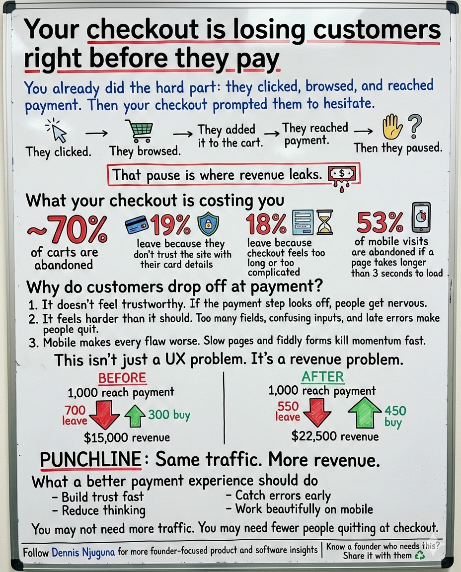
That pause is where a lot of revenue disappears.
This is the part many teams get wrong: when someone reaches checkout, you are not trying to create demand anymore. Demand is already there. The customer is close to buying. Your job is to make finishing feel safe, simple, and fast.
And the opportunity is bigger than most teams realize.
Baymard’s latest roundup puts average cart abandonment at 70.22%. Among the leading reasons, 19% of shoppers say they didn’t trust the site with their credit card information, and 18% say checkout was too long or complicated. Baymard also says the average large e-commerce site can increase conversion by 35.26% by redesigning checkout. Separately, Baymard’s checkout benchmark says 65% of sites have checkout UX that performs “mediocre” or worse, and only 2% are rated “good.”
That is why this is not “just UI.”
It is revenue infrastructure.
And on mobile, the margin for error gets even smaller. Google reports that 53% of mobile visits are likely to be abandoned if a page takes longer than 3 seconds to load. At the payment step, where trust is fragile and patience is thin, slow performance is not an inconvenience. It is a conversion killer.
This project was built around one outcome: Help customers complete checkout confidently and quickly especially on mobile without compromising security or accessibility.
What is payment UX?
Payment UX is the user experience of the payment step in checkout. It covers how secure, clear, fast, and easy the payment process feels when a customer enters card details or chooses a payment method.
Why does payment UX matter for conversion?
Payment UX matters because the payment step is the highest-intent point in the funnel. Baymard’s research shows average cart abandonment is about 70%, and top abandonment reasons include lack of trust in the site and checkout being too long or complicated. Better checkout design can materially improve conversion.
Why customers abandon at the payment step
Most checkout drop-off is not random.
It usually comes down to three predictable failures.
1. The payment page does not feel trustworthy enough
The moment card fields appear, the emotional stakes change.
Now the customer is not just thinking about the product. They are also thinking about risk. Is this secure? Is this site legitimate? Will something go wrong if I enter my details?
Baymard’s data shows that trust is not a soft issue. A meaningful share of shoppers leave because they do not trust the site with their payment information.
That trust is shaped by small but powerful cues:
- clear visual hierarchy
- familiar card-entry patterns
- calm, visible security messaging
- polished field states
- no surprise errors after submit
If the payment UI feels slightly off, the customer notices. And when a payment step feels off, hesitation spikes.
2. Checkout feels harder than it should
A lot of teams ship forms that are technically functional but cognitively expensive.
Too many fields.
Too many edge cases.
Formatting rules that are not obvious.
Errors that show up too late.
Layouts that force users to stop and think.
Baymard’s checkout research has found that “too long or complicated” remains one of the top reasons for abandonment, and it has also documented that checkout flows often contain more default form elements than users really need.
At this stage of the funnel, friction compounds fast. Customers do not “try harder” at payment. They bail.
3. Mobile amplifies every weakness
A checkout flow that feels merely annoying on desktop can become painful on mobile.
A small input becomes a mistap.
A slow page becomes an exit.
A bad validation pattern becomes frustration.
A cluttered layout becomes cognitive overload.
Google’s mobile speed data is the warning label here: more than half of mobile visits are likely to be abandoned if load time crosses 3 seconds. That is exactly why payment experiences should be designed mobile-first, not mobile-later.
Who this payment UI is for
This kind of payment experience matters anywhere conversion depends on a smooth, trusted checkout.
1) E-commerce teams
If your cart completion rate is underperforming, the payment step is one of the highest-leverage places to fix it.
2) SaaS companies
Trial-to-paid conversion often dies when card entry feels like paperwork instead of momentum.
3) Donation platforms
Giving is emotional and immediate. Friction kills impulse generosity fast.
4) Product, growth, and engineering teams
If you want conversion lift without buying more traffic, checkout is one of the smartest places to invest. Baymard’s research on redesign-driven conversion lift is the reason.
The approach: build a checkout closer
This project was not designed as a flashy front-end demo.
It was designed as a checkout closer.
That means every decision supports one of four goals:
a) Make the next action obvious
Reduce cognitive load. Remove ambiguity. Help users move forward without second-guessing the interface.
b) Prevent errors before submission
Nielsen Norman Group recommends inline validation whenever possible because it lets people fix mistakes immediately instead of dealing with error recovery after a failed submit.
c) Make the experience feel familiar
An interactive card preview and recognizable field patterns help users feel grounded. Familiarity reduces anxiety.
d) Reassure without clutter
Trust signals should support confidence, not overwhelm the page. Calm reassurance beats noisy overcompensation.
What this means for revenue
Checkout UX is one of the few places where product improvements can create immediate revenue impact.
Imagine 1,000 shoppers reach payment.
If roughly 70% abandon, only about 300 complete the purchase. At a $50 average order value, that is $15,000 in revenue. If better payment UX moves even a modest share of those almost-buyers across the line, revenue climbs without increasing traffic or ad spend. Baymard’s estimate that large sites can improve conversion by 35.26% through checkout redesign is exactly why this step deserves attention.
The point is not that every business gets the same lift.
The point is that checkout sits at the highest-intent moment in the funnel. Improving it usually pays back faster than chasing more top-of-funnel volume.
Key features that improve payment completion
1) Interactive card preview
When people can see what they are entering reflected in a familiar card format, the form feels less abstract and easier to verify.
Why it matters: it reduces uncertainty and helps users catch mistakes earlier.
<Card
  number={number}
  name={name}
  expiry={expiry}
  cvc={cvc}
  focused={focused}
  callback={this.handleCallback}
/>
2) Real-time formatting and inline validation
The form formats input as users type and clears errors as users fix them.
NN/g’s guidance supports this pattern because inline validation reduces interaction cost and makes correction easier in the moment.
Why it matters: fewer dead ends, fewer rage-submits, and a smoother path to completion.
1handleInputChange = ({ target }) => {
2  if (target.name === 'number') {
3    target.value = formatCreditCardNumber(target.value);
4  } else if (target.name === 'expiry') {
5    target.value = formatExpirationDate(target.value);
6  } else if (target.name === 'cvc') {
7    target.value = formatCVC(target.value);
8  }
9
10  const newErrors = Object.assign({}, this.state.errors);
11  delete newErrors[target.name];
12
13  this.setState({
14    [target.name]: target.value,
15    errors: newErrors
16  });
17};
3) Smart card type detection
Instead of making people pick a card type manually, the interface detects it and adjusts formatting automatically.
Why it matters: fewer decisions, less effort, faster completion.
1export function formatCreditCardNumber(value) {
2  const issuer = Payment.fns.cardType(value);
3  const clearValue = clearNumber(value);
4
5  switch (issuer) {
6    case 'amex':
7      return `${clearValue.slice(0, 4)} ${clearValue.slice(4, 10)} ${clearValue.slice(10, 15)}`;
8    case 'dinersclub':
9      return `${clearValue.slice(0, 4)} ${clearValue.slice(4, 10)} ${clearValue.slice(10, 14)}`;
10    default:
11      return `${clearValue.slice(0, 4)} ${clearValue.slice(4, 8)} ${clearValue.slice(8, 12)} ${clearValue.slice(12, 19)}`;
12  }
13}
4) Security-first trust signaling
Baymard’s abandonment data makes this non-negotiable: if shoppers do not trust the payment experience, they leave. Visible, well-placed reassurance helps reduce that anxiety.
Why it matters: trust is not decoration at checkout. It is a conversion factor.
1<div className="security-badge">
2  <svg><!-- Shield icon --></svg>
3  <span>Secured by 256-bit SSL encryption</span>
4</div>
5
6<div className="trust-badges">
7  <div className="trust-badge">PCI Compliant</div>
8  <div className="trust-badge">SSL Secured</div>
9  <div className="trust-badge">Encrypted</div>
10</div>
Security and accessibility are part of conversion
A payment interface is not production-ready just because it looks polished.
It is production-ready when the underlying data path is handled correctly and the interaction is usable for real people on real devices.
Stripe’s documentation says client-side tokenization collects sensitive payment details securely, returns a token to your server, and ensures sensitive card data does not touch your server.
W3C’s WCAG guidance also says touch targets should be at least 44 by 44 CSS pixels under the enhanced target-size criterion, which is especially relevant for mobile payment flows where accuracy matters.
That means accessibility and mobile ergonomics are not side concerns.
They are part of whether the customer completes payment at all.
Where to take this next
If you want to turn this into a full checkout engine, these are the next high-ROI moves:
- integrate a tokenized gateway like Stripe Elements
- add saved payment methods
- support 3DS or SCA where required
- add Apple Pay and Google Pay
- instrument field-level drop-off and completion time for testing
The bottom line
Checkout is where your customer stops being interested and starts deciding whether to trust you enough to pay.
That is the real job of payment UX.
Baymard’s data shows that customers leave when checkout feels complicated or untrustworthy. Google’s data shows how quickly mobile performance issues push users out. NN/g shows why inline validation reduces friction. Stripe shows what secure payment handling should look like. W3C shows why touch-friendly target sizing matters.
If your checkout, subscription upgrade flow, or donation experience is underperforming, this is not a small detail.
It is one of the clearest growth opportunities in your product.
Want help reviewing your checkout or payment flow? Book a discovery call.↗
I help founders build scalable, production-grade software that supports growth especially in the product moments where speed, trust, and conversion directly affect revenue.
Share this article
Send it to someone who would find it useful.