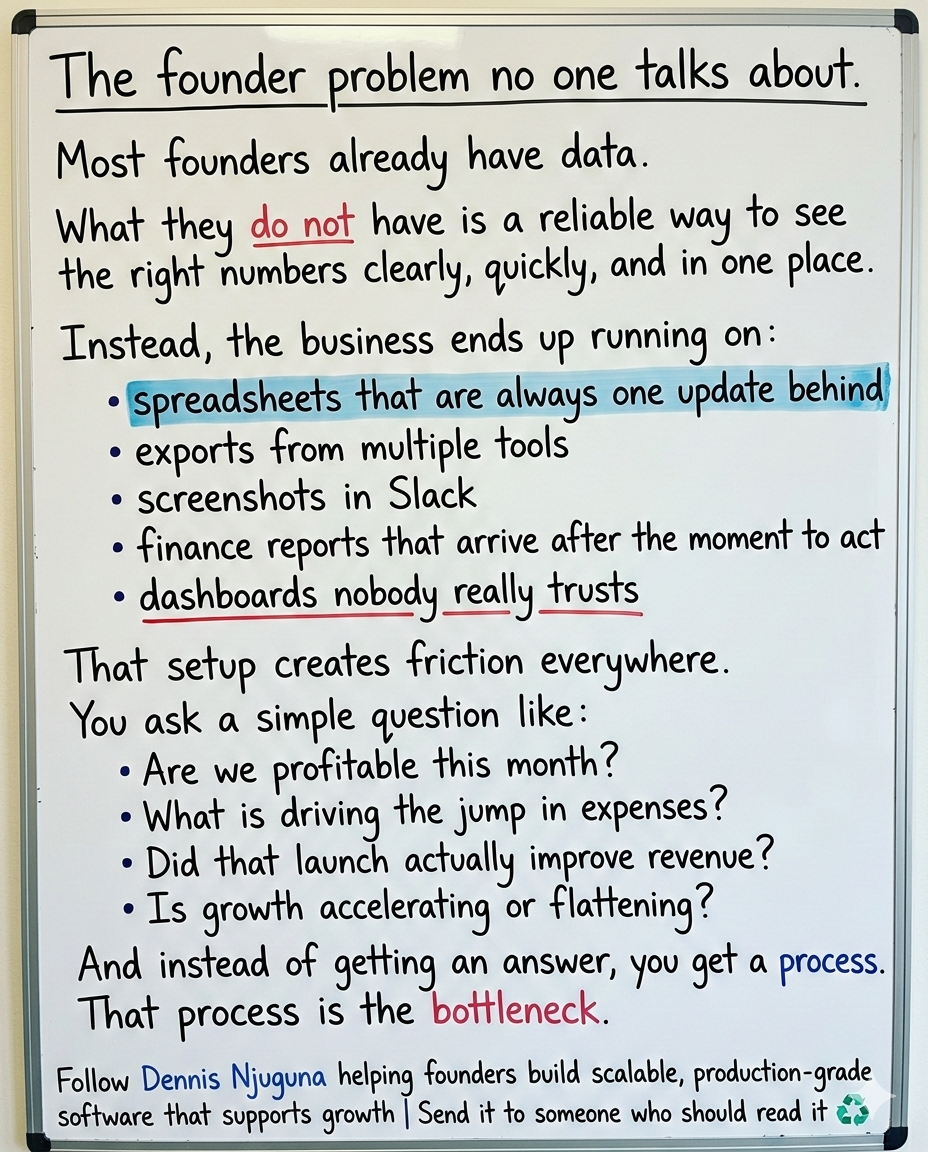
If you have ever watched a leadership meeting stall over which spreadsheet is correct, you already know the real problem is not a lack of data.
It is slow, fragmented insight.
Your team has the numbers. What it lacks is a fast, clear way to use them.
That gap is becoming more expensive. A Salesforce survey found that 76% of business leaders feel increasing pressure to support their arguments with data. Gartner also reports that 61% of organizations are being pushed to evolve their data and analytics operating model because of AI.
The standard has changed.
Dashboards can no longer be static charts that look good in a review meeting. They need to help people answer important questions fast, on any device, while there is still time to act.
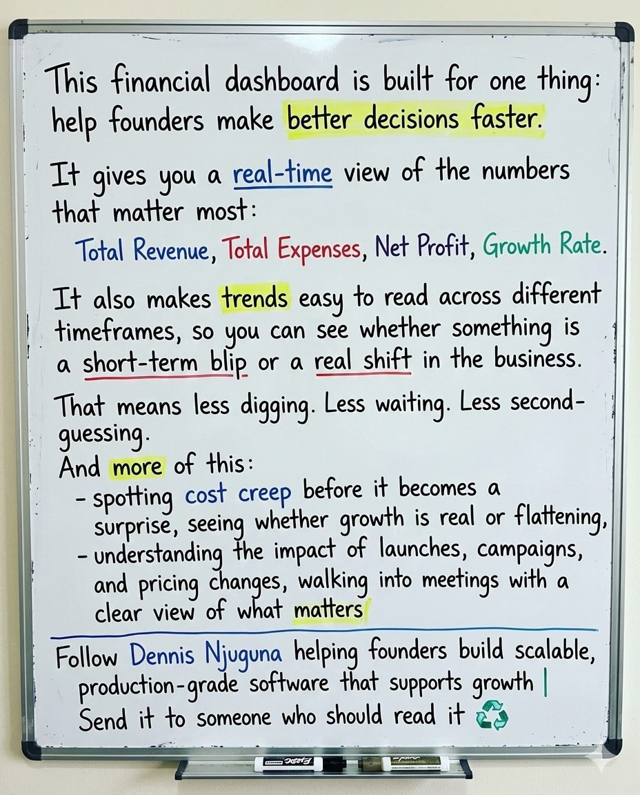
That is exactly what this project is built to do.
This is a modern, real-time financial analytics dashboard built with React and Chart.js. It gives teams an immediate view of the numbers that matter most, so they can stop chasing reports and start making better decisions.
It helps answer questions like:
- Are we actually profitable this month?
- Where are expenses rising?
- Is growth accelerating or flattening?
- What changed after that launch, campaign, or pricing update?
What this dashboard solves
1) Too many reports, not enough clarity
In most businesses, finance data is scattered across spreadsheets, exports, email attachments, and BI tools.
That creates confusion, delay, and distrust.
This dashboard brings key financial metrics into one clear visual view, so your team can stop hunting for data and start acting on it.
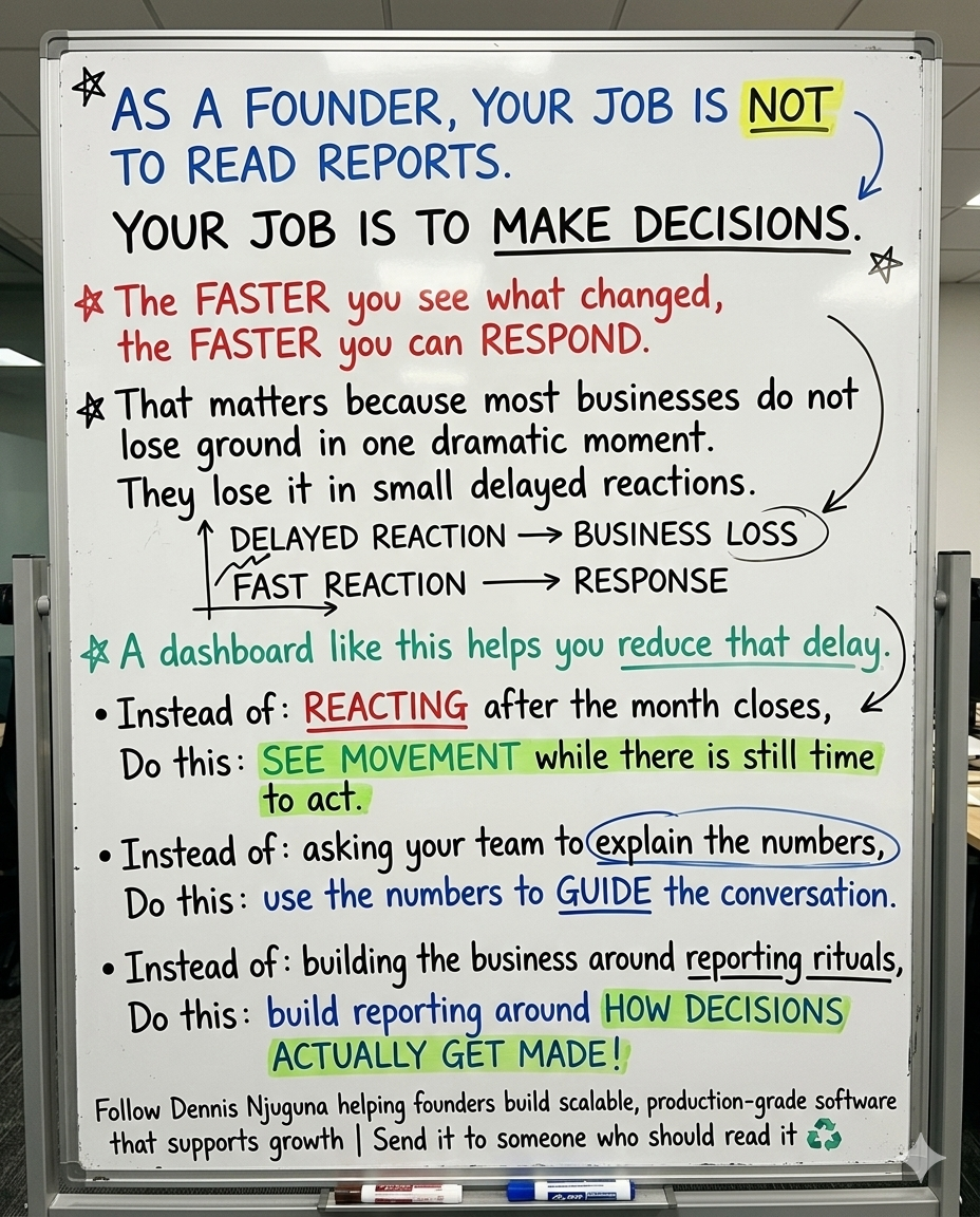
2) Decisions arrive too late
If it takes hours to build the chart or until the end of the day to get an update, the insight is already late.
This dashboard makes key metrics interactive and immediate. Switch time ranges, hover for details, and see KPIs update instantly. Instead of reacting after the fact, your team can respond while the change is still happening.
3) Most dashboards still do not work where decisions happen
A lot of dashboards still behave like desktop-only tools. That is a problem because decisions do not only happen at a desk.
DataReportal reports that about 57.9% of web traffic comes from mobile phones, and 96% of internet users use a mobile phone to access the internet at least some of the time.
If your analytics tool does not work well on mobile, it slows the business down.
This dashboard is designed to be responsive, usable, and clear across devices.
Who this is for
This dashboard is useful for teams that need faster financial visibility without adding more reporting overhead.
It is especially useful for:
- founders and small business owners who need quick insight without enterprise BI complexity
- CFOs and finance leads who want reliable, presentation-ready trends fast
- sales and marketing leaders connecting campaign activity to revenue movement
- product and growth teams measuring the impact of launches
- operations teams spotting cost creep before it becomes a bigger problem
What makes this dashboard useful
This project focuses on one outcome: turn financial data into action.
That means every part of the build is designed to reduce friction and improve clarity.
Multi-timeframe analysis
Different time windows reveal different truths. A one-month view helps teams catch recent shifts. A one-year view helps them see the bigger trend.
KPI cards plus trend visualization
Leaders need both the headline numbers and the context behind them. KPI cards show the current state. Trend charts show direction.
Interactive charts
Users can drill into the details without cluttering the screen. The trend is visible at a glance, and the numbers are available when needed.
Fast performance
Speed matters. According to Nielsen Norman Group, 0.1 seconds feels instantaneous, around 1 second keeps users in flow, and longer delays start to break attention. This dashboard is designed so switching time ranges feels immediate.
Mobile-first layout
If leaders cannot check the dashboard quickly on a phone, they will not build the habit of using it.
Why this matters to the business
When analytics is easy to access and easy to understand, teams use it more often and act on it faster.
McKinsey has highlighted that high-performing organizations are 3x more likely than others to say their data and analytics initiatives contributed at least 20% to EBIT.
This dashboard supports that kind of business impact by improving the layer teams use every day.
Here is what that looks like in practice:
- Less manual reporting because key numbers are already visible
- Earlier problem detection because spikes in expenses or margin pressure show up sooner
- Faster alignment because teams work from the same visual view instead of arguing over tabs and exports
Features that drive action
1) Multi-timeframe analysis
User benefit: Teams can zoom in on short-term changes or zoom out to evaluate long-term trends.
How it works: The selected time range becomes the single source of truth, and KPIs plus charts update from that state.
const [timeRange, setTimeRange] = useState("6M");2) Real-time KPI cards
User benefit: The most important numbers are always visible, with no digging required.
1const StatCard = ({ title, value, change, isPositive, icon }) => (
2  <div className="stat-card">
3    <div className="stat-header">
4      <div className="stat-icon">{icon}</div>
5      <span className="stat-title">{title}</span>
6    </div>
7    <div className="stat-value">{value}</div>
8    <div className={`stat-change ${isPositive ? "positive" : "negative"}`}>
9      <span className="arrow">{isPositive ? "↑" : "↓"}</span>
10      {change}
11    </div>
12  </div>
13);
3) Interactive charts with details on demand
User benefit: Users see the story first, then the details when they need them.
1const getChartOptions = (timeRange) => ({
2  responsive: true,
3  maintainAspectRatio: false,
4  animation: {
5    duration: 750,
6    easing: "easeInOutQuart",
7  },
8  plugins: {
9    tooltip: {
10      mode: "index",
11      intersect: false,
12      callbacks: {
13        label: function (context) {
14          return context.dataset.label + ": $" + context.parsed.y + "k";
15        },
16      },
17    },
18  },
19});
4) Fast switching with memoized derived data
User benefit: Time-range changes feel instant, which makes the dashboard feel trustworthy and easier to use regularly.
1const chartData = useMemo(() => {
2  const rangeData = timeRangeData[timeRange];
3  return {
4    labels: rangeData.labels,
5    datasets: [
6      {
7        label: "Revenue",
8        data: rangeData.revenue,
9      },
10      {
11        label: "Expenses",
12        data: rangeData.expenses,
13      },
14    ],
15  };
16}, [timeRange]);
Architecture built for scale
The dashboard follows a simple three-layer structure:
Presentation → Logic → Data
That separation makes the system easier to maintain, extend, and scale.
1┌───────────────────────────────────────┐
2│ Presentation Layer (UI)               │
3│  - StatCard components                │
4│  - Time range selector                │
5│  - Chart.js Line chart                │
6└───────────────────────────────────────┘
7                ▲
8                │ props (data + config)
9                ▼
10┌───────────────────────────────────────┐
11│ Business Logic Layer                  │
12│  - timeRange state (useState)         │
13│  - derived chartData (useMemo)        │
14│  - derived KPI stats                  │
15└───────────────────────────────────────┘
16                ▲
17                │ lookup (O(1))
18                ▼
19┌───────────────────────────────────────┐
20│ Data Layer                            │
21│  - timeRangeData hash map             │
22│  - labels + revenue + expenses + stats│
23└───────────────────────────────────────┘
The data layer uses a hash map so each time range can be accessed directly instead of repeatedly filtering arrays.
That keeps the app fast, predictable, and easy to expand.
const timeRangeData = {
  "1M": { labels: [...], revenue: [...], expenses: [...], stats: {...} },
  "3M": { ... },
  "6M": { ... },
  "1Y": { ... },
  "ALL": { ... },
};
How to take this into production
This repo uses in-memory data to keep the example simple. In production, most teams would add:
1) API-backed metrics
Pull live data by range instead of relying on local mock data.
const fetchData = async (timeRange) => {
  const res = await fetch(`/api/metrics?range=${timeRange}`);
  if (!res.ok) throw new Error("Failed to fetch");
  return res.json();
};
2) Caching and background refresh
Use tools like React Query so the UI stays fast while data refreshes in the background.
3) Role-based access and audit trails
Financial analytics often requires access controls, permissions, and traceability.
The takeaway
A financial dashboard should do more than visualize data.
It should help your team make decisions faster.
If your current setup still depends on spreadsheets, delayed reports, or disconnected tools, you are paying for that friction every week in slower responses, weaker alignment, and missed opportunities.
This React and Chart.js dashboard is built to remove that friction.
It gives your team:
- clear KPIs
- interactive trends
- faster access to the numbers that matter
- a mobile-ready experience people can actually use
That is what turns analytics from a reporting exercise into a decision tool.
If your team is still piecing together reports by hand, the next step is not more data. It is better visibility.
Share this article
Send it to someone who would find it useful.