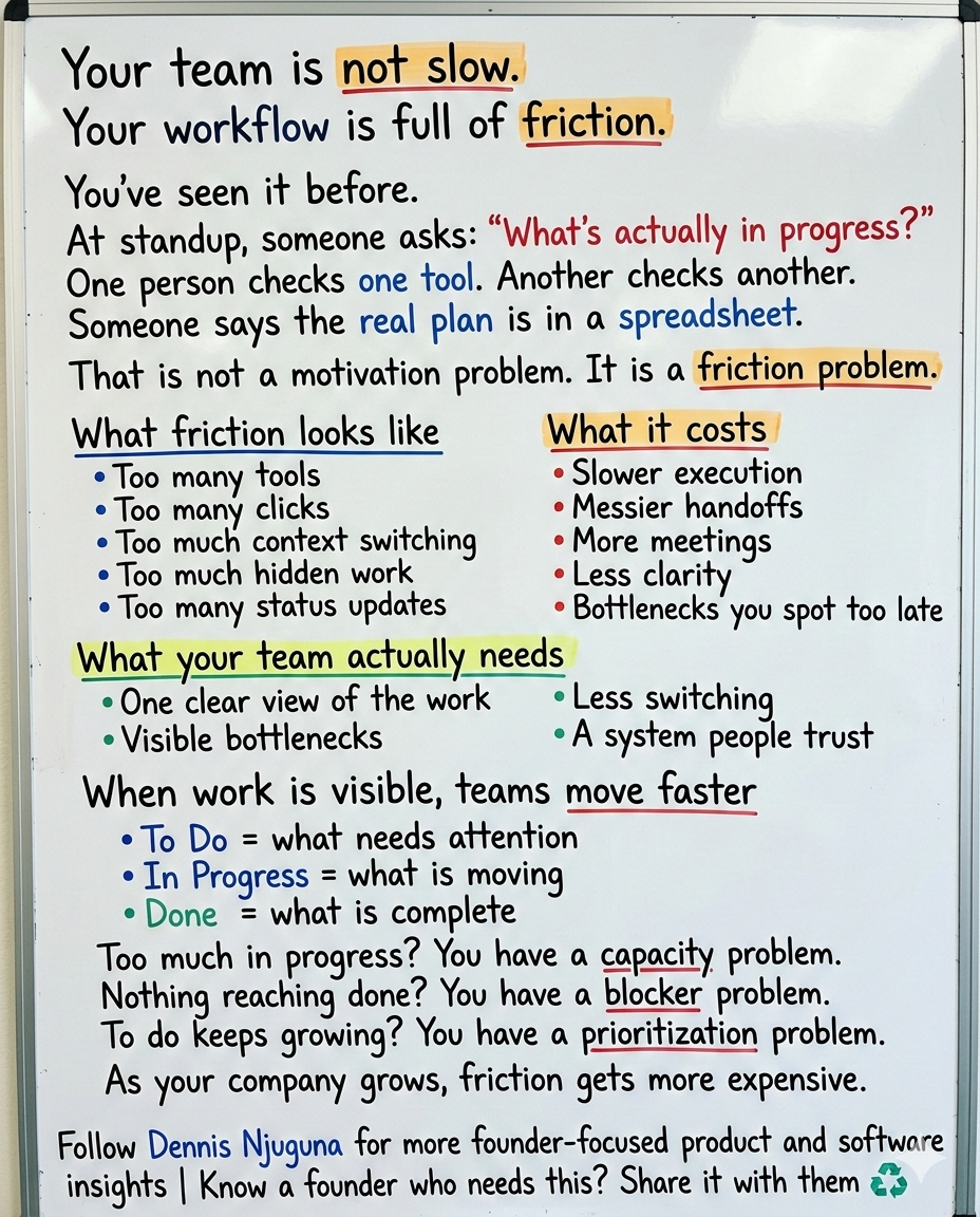
Let’s start with a scene you’ve probably lived through.
It’s a standup. Someone asks, “What’s actually in progress?”
One person opens Jira. Another checks Notion. Someone else says the real plan is in a spreadsheet. A fourth person is pretty sure the latest status was shared in Slack yesterday. Nobody is lying. Nobody is lazy. But nobody is looking at the same reality.
That is what fragmented work feels like.
And it is far more common than most teams want to admit. Asana says the average knowledge worker switches between 10 and 25 apps per day. Atlassian’s 2024 State of Teams found that 55% of knowledge workers find it hard to track down information, 56% say teams at their company plan and track work in different ways, and Atlassian’s 2025 research says leaders and teams waste 25% of their time just searching for answers.
That is not a productivity problem.
It is a friction problem.
And friction is expensive. PMI’s Pulse of the Profession put wasted investment from poor project performance at 11.4% in 2020, and its 2021 report still showed 9.4% wasted. PMI’s 2024 global research, built on input from more than 10,000 project professionals and 150+ interviews, pushes the conversation even further: project success is not just about scope, time, and budget anymore. It is about whether the work actually delivers value worth the effort and expense.
That is the context for this project.
The project is a modern kanban task management software concept built to reduce cognitive friction: a React-based board with smooth drag-and-drop, responsive layouts, live stats, and a UI designed to make work visible instead of buried. It is not trying to out-feature every enterprise Project Management suite. It is showing a more important idea: When task management feels lighter, teams move faster.
What is kanban task management software?
Kanban task management software is a visual system for organizing work into stages such as To Do, In Progress, and Done. Its main value is visibility: teams can see what is moving, what is blocked, and where capacity is getting overloaded.
Why do teams stop using task management tools?
Usually because the tool creates too much friction. If updating work feels slow, confusing, or disconnected from how the team actually operates, the data goes stale and trust disappears.
Why does visual task management work?
Visual systems reduce the effort required to understand status, priorities, and bottlenecks. That makes coordination faster and decisions easier.
What should a modern kanban board app include?
At minimum: fast interactions, responsive design, clear visual hierarchy, real-time updates, accessible controls, and a clean state model that can scale into production.
Why most task management software slows teams down
A lot of tools fail for the same reason.
They make the mechanics of managing work feel heavier than the work itself.
You see it in status-heavy workflows. You see it in interfaces that hide the important signal behind tabs, modals, and settings. You see it in systems that technically “track” work but make updating work feel like admin overhead.
That creates a vicious loop.
If updating a task is annoying, people postpone it.
When people postpone it, the board gets stale.
When the board gets stale, nobody trusts it.
When nobody trusts it, they go back to meetings, messages, and side spreadsheets.
That is how teams end up coordinating constantly without ever feeling fully aligned.
Asana’s Anatomy of Work research says knowledge workers spend 60% of their time on “work about work”: chasing updates, attending unnecessary meetings, searching for information, switching tools, and managing shifting priorities. The same research says 88% believe time-sensitive work has fallen behind or through the cracks because of how much is already on their plate.
That is why I think the best task management software is not the one with the longest feature list.
It is the one that removes the most friction between intention and action.
What problem does this project solve?
It is designed around a simple belief: Make the right action the easiest action.
In practice, that means solving three common problems.
1) Work stays invisible until it becomes a problem
When work lives inside long lists, nested menus, and scattered tools, bottlenecks stay hidden until deadlines start slipping.
A visual Kanban board fixes that by making flow obvious.
Too many tasks in In Progress? You likely have a capacity problem.
Nothing is moving into Done? You may have blockers or review bottlenecks.
A huge To Do column? Prioritization is probably broken.
This sounds basic, but it is exactly what many teams are missing: one shared operational view of reality.
That matters because fragmented visibility is one of the biggest causes of execution drag. Atlassian’s 2024 research found that only 24% of teams’ work is estimated to be mission-critical, while 64% of knowledge workers say their team is constantly being pulled in too many directions. The same report found that teams with systems to identify top-priority work are 4.6x more likely to be productive.
2) Context switching kills momentum
Every extra click feels small until it happens 100 times a day.
A status edit modal.
A dropdown.
A confirmation step.
A second screen just to update one field.
This is where good kanban task management software earns its keep. The interaction should be direct. Grab the card. Move the card. Done.
It is built around that kind of direct manipulation. Instead of asking users to describe the state change in a form, it lets them perform the state change visually. That matters because high-friction tools turn basic coordination into a mental tax.
And that tax is not theoretical. Between app switching, duplicative work, and information hunting, Asana says knowledge workers spend 103 hours a year in unnecessary meetings, 209 hours on duplicative work, and 352 hours talking about work.
3) Slow UI quietly kills adoption
Teams do not keep using tools that feel sluggish.
That is especially true on mobile, where patience disappears even faster. Google’s current Core Web Vitals guidance says good pages should keep Largest Contentful Paint within 2.5 seconds, Interaction to Next Paint at 200ms or less, and Cumulative Layout Shift at 0.1 or less. And Google’s long-cited mobile benchmark still hangs over product teams: 53% of users abandon sites that take longer than three seconds to load.
It is built to feel responsive because performance is not a polish layer. It is part of usability.
Google’s RAIL guidance says users perceive interactions as immediate when responses happen within 100ms, and smooth animation depends on producing frames in roughly 10ms of app work within a 16ms frame budget.
That is why small details matter here: drag motion that feels stable, hover states that signal affordance, and instant board updates that reduce uncertainty.
Because uncertainty is friction too.
Why visual task management works
Visual task management is not popular because it looks nice.
It works because it aligns with how people process information.
MIT neuroscientists found that the brain can identify images seen for as little as 13 milliseconds. That does not mean every dashboard is automatically useful. It means visual structure has real cognitive advantages when it helps people spot patterns quickly.
That is why a Kanban board is so effective when designed well.
You are not asking the user to decode a database view.
You are not making them hunt for state.
You are showing the work.
That is the real power of a visual board:
- status becomes glanceable
- bottlenecks become visible
- capacity becomes legible
- conversations become shorter because the shared context is already on screen
A good board does not just organize work. It reduces the cost of understanding the work.
What makes the project different
It's not interesting because it is another board.
It is interesting because of how it handles the little moments where most tools create drag.
1) Smooth drag-and-drop
Moving a task should feel like one action, not a mini workflow.
It uses drag-and-drop so status changes happen through direct interaction. Under the hood, that means onDragEnd handlers, immutable state updates, and targeted re-renders. At the UX level, it means the board feels immediate.
For a demo, that interaction model still holds up well. For a production build in 2026, I would not keep react-beautiful-dnd as the long-term choice. Atlassian deprecated it in October 2024 and the GitHub repository was archived in August 2025. Today, a maintained option such as dnd-kit, which positions itself as production-ready and built for performance, accessibility, and reliability, is the more practical direction.
2) Real-time stats without another dashboard
Most teams do not need more dashboards. They need less guessing.
It shows live counts for each column and total workload so users can see board health instantly. That reduces the need for manual counting, separate status views, and mid-meeting interpretation.
This is a small feature with outsized value because visibility changes behavior. When overload is visible, teams can rebalance sooner.
3) Micro-interactions that clarify, not decorate
Hover lift. Drag tilt. Drop feedback.
These details make the interface feel polished, but their real job is to tell users what is interactive and what just happened. That kind of feedback matters because Google’s RAIL model ties perceived speed directly to trust: users feel an interaction is immediate when the response lands inside that fast-response window.
4) Responsive layout that respects real work
Work does not happen only on a wide desktop monitor.
People check tasks during meetings, between calls, on tablets, and on phones. That is why it is designed to collapse cleanly from multi-column desktop layouts to narrower screens without becoming unreadable.
For any modern task management app, that is table stakes.
The engineering side: why clean architecture matters
It's also a useful reference implementation for engineering teams.
It demonstrates a few habits that scale well:
- immutable state updates, which make board changes predictable and React rendering efficient
- CSS Grid-based layout, which handles responsiveness without layout hacks
- design tokens for colors, spacing, shadows, and typography, which keep the UI coherent as the product grows
- a board state shape that maps naturally to drag-and-drop semantics and API persistence
That last part matters more than it gets credit for. Clean internal structure is not just a developer convenience. It affects how fast features can be shipped, how safely changes can be made, and how reliable the product feels over time.
Users may never see your state model.
They absolutely feel the consequences of a messy one.
That is a big part of the work I do with founders: building scalable, production-grade software that supports growth instead of collapsing under it.
Who benefits most from Kanban task management software like this?
This kind of product works anywhere work moves through visible stages.
- Software teams can turn standups into real operating reviews instead of status archaeology.
- Marketing teams can re-prioritize campaigns without rebuilding the entire plan.
- Support teams can spot overload early by watching WIP pile up in real time.
- Ops teams can manage intake, processing, and completion with less spreadsheet chaos.
- Founders and small teams can make progress visible without adopting a heavyweight process too early.
The pattern is the same in every case:
✅ When work is easy to see, it is easier to manage.
✅ When it is easier to manage, it is easier to trust.
✅ When teams trust the system, they move faster inside it.
How to take it from demo to production
If you wanted to evolve this into production-grade kanban task management software, I would start here:
1) Persistence
Start with local storage, then move to backend persistence so the board remains useful across sessions and devices.
2) Real-time collaboration
Add WebSockets or a real-time sync layer so multiple users can update the board without stale state.
3) Accessibility
Support keyboard drag-and-drop, focus states, ARIA announcements, and touch-friendly interactions.
4) Flow control
Add WIP limits, blocked states, due dates, and SLA-aware alerts where appropriate.
5) Analytics
Track cycle time, throughput, aging work, and bottleneck patterns so the board becomes both a workflow tool and a decision tool.
6) Permissions and auditability
As soon as a tool becomes operationally important, teams need role-based access, change history, and confidence that the data is dependable.
That is the point where a nice demo becomes a real business system.
Final thought
Most teams do not need more motivation.
They need less friction.
That is the bigger lesson behind the project and, honestly, behind a lot of internal software problems. The bottleneck is often not that people do not care. It is that the system makes it too hard to maintain shared clarity.
The best kanban task management software does not just organize tasks.
It reduces switching.
It makes work visible.
It shortens coordination loops.
It gives teams one shared picture of reality.
And it feels fast enough that people actually keep it updated.
That is where the ROI is.
Not in “more features.”
In less drag.
If you are a founder building software for a growing team, this is exactly the kind of thing worth getting right early. Because once your team scales, friction compounds.
And if you are at the stage where your product or internal tools need to support growth without creating more chaos, book a discovery call↗. I help founders build scalable, production-grade software that supports growth.
And if you want more breakdowns like this on product UX, architecture, and building software people actually want to use, subscribe to the newsletter↗.
Share this article
Send it to someone who would find it useful.