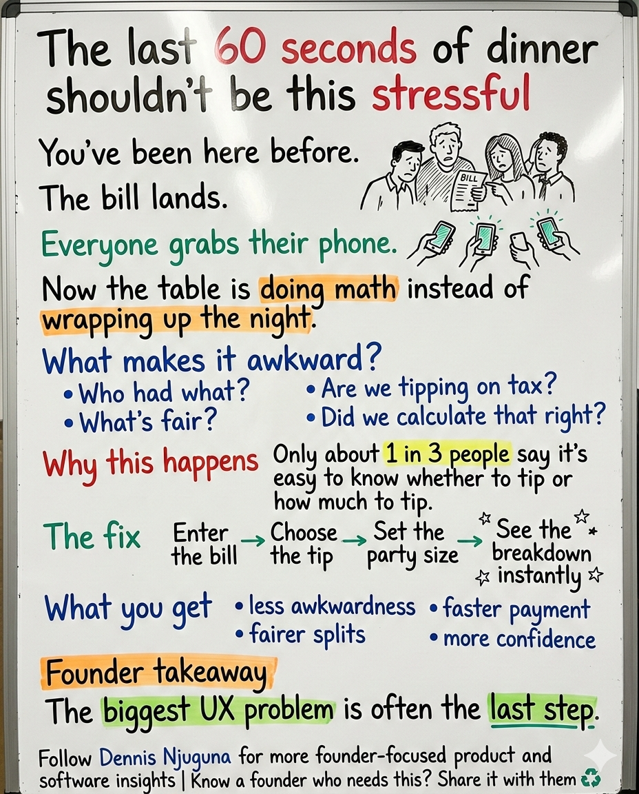
Picture this: the bill lands on the table, everyone reaches for their phone, and suddenly the night is no longer about dinner.
It is about awkward math.
It is about uneven splits.
It is about “wait, are we tipping on tax?”
And almost every time, one person quietly ends up doing the work while everyone else debates percentages.
That moment looks small from the outside. It isn’t.
It is where customer experience, staff income, payment speed, and social friction all collide.
And the confusion is real, not imagined. In Pew Research Center’s 2023 study of nearly 12,000 U.S. adults, 72% said tipping is expected in more places than it was five years ago, yet only 34% said it is easy to know whether to tip and just 33% said it is easy to know how much to tip. Pew also found more Americans oppose suggested tip amounts on screens and receipts than favor them, 40% to 24%.
That is exactly the kind of friction good software should remove.
So I built Tip Calculator (React Hooks Edition) to solve the last-mile chaos of tipping and bill splitting with a clean, fast, modern experience: enter a bill, choose a tip, set party size, and instantly get a transparent breakdown.
No mental math.
No guesswork.
No “did we do that right?”
Why this problem matters more than it looks
Founders often underestimate these tiny moments because they do not look strategic.
They look operational.
But users do not experience your product that way. They experience the final moment emotionally.
If the end of the flow feels awkward, unclear, or slow, that feeling bleeds backward into their judgment of the entire experience.
That is especially true in payments.
Tipping is a perfect example. Pew found that 77% of U.S. adults say service quality is a major factor in deciding whether and how much to tip. In other words, people want tipping to feel intentional and fair, not random or pressured. Cornell research has also found that tip size is reliably correlated with service ratings once you control for stable differences between tippers, which supports the idea that people do try to match gratuity with perceived service quality.
So when the interface makes tipping feel murky, the product is not just creating math friction.
It is interfering with a social judgment people actually care about getting right.
What problem does a tip calculator for splitting bills solve?
1. Decision friction at checkout
When the rules feel unclear, people hesitate.
That hesitation is expensive. It slows the end of the experience, lowers confidence, and turns a simple payment into a group negotiation. Pew’s findings on tipping confusion and resistance to suggested tip prompts make the point clearly: people do not just want a number; they want clarity without pressure.
A good tip calculator lowers the emotional temperature.
It does not push the user.
It helps the user decide.
2. Group fairness problems
This is where “quick math” stops being quick.
When a group splits the bill, the problem is not only arithmetic. It is incentives, fairness, memory, and social pressure. In a field experiment published in The Economic Journal, Uri Gneezy, Ernan Haruvy, and Hadas Yafe found that diners consumed more when the cost was split than when each person paid individually, producing what they describe as a substantial loss of efficiency.
That matters because the bill-splitting moment is rarely neutral.
Someone feels they paid too much.
Someone feels another person got away with something.
Someone just wants it over with.
A split bill calculator that makes the outcome explicit reduces ambiguity, which reduces debate.
3. Speed and trust on mobile
This kind of tool is usually used on a phone, in a noisy environment, under time pressure, often with weak attention and less-than-perfect connectivity.
That makes performance part of the product, not a technical afterthought.
Google states that 53% of mobile visits are likely to be abandoned if pages take longer than 3 seconds to load. Google’s Core Web Vitals guidance also recommends an LCP of 2.5 seconds or less and an INP of 200 milliseconds or less for a good user experience.
So even a “small” calculator should be lightweight, responsive, and instant-feeling.
Because mobile patience is brutal.
Who this is for
This project is useful if you are building products where payment math shows up in real life:
- restaurant groups and everyday diners who want fast, fair splits
- hospitality apps that want a smoother checkout or QR-pay experience
- fintech and wallet products adding split-and-tip utility
- service businesses where gratuities are common but expectations vary
- product teams that want a clean React Hooks reference with validation and UX polish
That is also why this project is bigger than a demo.
It is a compact example of product-minded engineering: solve a real friction point, make it trustworthy, and keep the implementation clean enough to scale.
What was the product approach?
This is not a “hello world” calculator.
The design goal is simple: make tip-splitting feel effortless and trustworthy.
That changes how you build it.
You stop thinking like a developer making a calculator.
You start thinking like a founder trying to reduce friction in a high-intent moment.
That is why the approach is deliberately product-minded:
- guardrails before math
- transparency over magic
- two speeds of input
- professional formatting
- clean, extensible architecture
Each of those choices matters because each one answers a user's fear.
Did I type this right?
Did it calculate correctly?
Is this fair?
Can I do this quickly?
Can I try another scenario without starting over?
Good UX is often just a series of calm answers to anxious questions.
Business impact and real-world use cases
1. Restaurant groups and team dinners
The obvious use case is the one most people have lived through.
A group finishes dinner. The experience has been great. Now everyone wants the exit to feel just as smooth as the meal.
With this flow, the user enters the bill, chooses a tip percentage, sets the number of people, and sees the breakdown instantly:
- total tip
- tip per person
- total per person
The value is not just convenience.
It is reducing the chance that the final minute becomes the worst part of the experience.
And for hospitality businesses, that end-of-meal moment matters. Pew’s data shows tipping is still heavily tied to service perceptions, and Cornell’s work suggests service-related beliefs and behaviors still shape how gratuities function in practice.
2. Exceptional service moments
Not every tipping scenario is routine.
Sometimes the service is genuinely memorable, and people want to reward it. The problem is that many users know they want to tip more but do not know what “more” should look like.
That is why supporting a wider range, with clear labels, works better than forcing users to guess.
It aligns with how people actually think: not in abstract percentages, but in categories like average, great, outstanding, above and beyond.
And the underlying behavior is there. Pew found that 77% of adults say service quality is a major factor in whether and how much they tip. Cornell’s within-subject analysis similarly found a reliable relationship between service ratings and tip size after controlling for the identity of the tipper.
3. Embedded utility inside hospitality, fintech, and SaaS products
This is where the feature becomes strategic.
If you run a hospitality platform, digital wallet, booking flow, or point-of-sale companion app, a tip-and-split utility can do more than solve one task. It can make the whole product feel more helpful at the moment users are most likely to judge it harshly: when money is involved.
That matters because clarity and speed are both trust signals.
Users rarely say, “Your information hierarchy increased my cognitive load.”
They just hesitate.
Or bounce.
Or lose confidence.
Key features and how users benefit
1. Intelligent validation
User benefit: fewer frustrating “why is this broken?” moments.
The calculator validates early so users do not get garbage outputs, impossible values, or confusing states. Instead of waiting for a bad result, the interface catches the issue where it starts.
1const handleCalculate = () => {
2  const b = parseFloat(bill);
3  const p = parseInt(people, 10);
4  const perc = Number(percentage);
5
6  if (isNaN(b) || b <= 0) {
7    setError("Please enter a valid bill amount.");
8    setResult(null);
9    return;
10  }
11  if (isNaN(p) || p <= 0) {
12    setError("Please enter number of people (at least 1).");
13    setResult(null);
14    return;
15  }
16  if (isNaN(perc) || perc <= 0) {
17    setError("Please choose a tip percentage.");
18    setResult(null);
19    return;
20  }
21
22  // ... calculation proceeds
23};
Technically, this keeps the app stable. Product-wise, it makes the UI feel dependable.
2. Professional currency formatting
User benefit: results look real, precise, and trustworthy.
Money should always look like money. Clean currency formatting prevents ugly floating-point outputs and makes the result feel credible.
const currency = (value) =>
  new Intl.NumberFormat("en-US", {
    style: "currency",
    currency: "USD",
  }).format(value);
This is a tiny detail with outsized impact because formatting is not decoration.
Formatting is trust.
3. Transparent breakdowns
User benefit: users can see exactly how the number was produced.
Instead of a single magic number, the calculator shows the total tip, tip per person, and total per person. That is what reduces disputes.
const totalTip = (b * perc) / 100;
const tipPerPerson = totalTip / p;
const totalPerPerson = (b + totalTip) / p;

setResult({ totalTip, tipPerPerson, totalPerPerson });
If a user can explain the result in one sentence, you have probably designed the output well.
4. Dual input methods
User benefit: faster for experienced users, clearer for everyone else.
Some users want quick presets. Others want descriptive labels. A good interface supports both without making either group work harder.
Quick presets:
{[0, 10, 15, 18, 20, 25, 30, 40, 50, 75, 100].map((p) => (
  <button
    className={`preset ${Number(percentage) === p ? "active" : ""}`}
    onClick={() => quickPick(p)}
  >
    {p}%
  </button>
))}
Dropdown with labels:
<select value={percentage} onChange={(e) => setPercentage(Number(e.target.value))}>
  <option value={20}>20% - Good</option>
  <option value={25}>25% - Great</option>
  {/* ... more options */}
</select>
This is one of those patterns that looks small in code but large in behavior. Different users want different kinds of confidence.
5. One-click reset
User benefit: easy scenario testing.
People do not calculate once and stop. They compare. What if it is 18%? What if it is 25%? What if six people are paying instead of five?
Reset turns recalculation into a first-class use case instead of a nuisance.
const handleReset = () => {
  setBill("");
  setPeople("");
  setPercentage(0);
  setResult(null);
  setError("");
};
Architecture deep-dive: why this is simple, but production-shaped
This is a single-component React app by design.
That is not because the problem is trivial. It is because the problem benefits from clarity.
A compact architecture gives you:
- predictable state transitions
- fewer moving parts
- easier testing
- easier extension into larger products
Component layout:
1App.js
2├─ State (useState)
3│  ├─ bill: string
4│  ├─ people: string
5│  ├─ percentage: number
6│  ├─ result: { totalTip, tipPerPerson, totalPerPerson } | null
7│  └─ error: string
8├─ Helpers
9│  ├─ currency()
10│  ├─ handleCalculate()
11│  ├─ handleReset()
12│  └─ quickPick()
13└─ UI
14   ├─ Inputs (bill, people, percentage)
15   ├─ Error (conditional)
16   ├─ Actions (calculate/reset)
17   └─ Results (conditional)
Data flow:
User types bill/people ──> setBill / setPeople (controlled inputs)
User picks percent ──────> setPercentage (preset or dropdown)
User clicks Calculate ───> validate → compute → setResult
React re-renders ───────> results appear (formatted currency)
That is what makes this useful as a reference implementation.
It is simple enough to understand quickly, but structured enough to grow into a real product module with tax handling, service charges, uneven splits, localization, saved presets, or shareable results.
UX and accessibility notes that actually matter
A calculator like this is often used under bad conditions: dim light, one hand, social pressure, distraction, and time pressure.
That is exactly when accessibility stops being a compliance checkbox and becomes product quality.
For text contrast, WCAG’s baseline guidance remains a solid standard: normal text should have a contrast ratio of at least 4.5:1.
For performance, speed is still part of usability. Google’s 3-second abandonment guidance and Core Web Vitals thresholds are good reminders that “fast enough” is usually slower than users will tolerate, especially on mobile.
In other words:
- If the UI is hard to read, the product feels harder.
- If the page is slow to respond, the math feels less trustworthy.
- If the flow feels fragile, users do not blame themselves. They blame the product.
And they should.
How to extend this into a real product module
If this were moving from a standalone tool into a live product, these would be the highest-value next steps:
1. Tax and service charge handling
Many users are unsure whether to tip on subtotal or total. That is a perfect example of hidden friction. Make it explicit.
2. Rounding strategy
Groups often want clean numbers. Per-person rounding, remainder handling, and reconciliation logic all matter once this becomes part of a real payment workflow.
3. Uneven splits
Real groups are messy. Someone skipped drinks. Someone covered dessert. Someone arrived late. A production version should support weighted or itemized splits.
4. Localization
Currency, locale, language, and tipping norms vary by market. The cleaner the formatting layer, the easier this becomes.
5. Shareable results
A simple summary that can be copied into the group chat reduces repetition and keeps the agreement visible.
Why this “small” app is a real business feature
A tip calculator for splitting bills is not just a calculator.
It is a tiny piece of software solving a very human problem at a high-friction moment.
It helps diners feel confident.
It helps groups move faster.
It helps gratuities better reflect intent.
And it helps digital products feel more useful when users are most likely to scrutinize them.
That is the part a lot of teams miss.
The best products are not the ones that merely compute correctly.
They are the ones that make the user feel calm while they complete the task.
That is the standard I build toward.
I help founders build scalable, production-grade software that supports growth, and this project is a good example of how I think: find the friction, remove the ambiguity, and make the experience feel reliable under real-world conditions.
If you are building a hospitality, fintech, or customer-facing product where payment friction is quietly hurting trust or conversion, book a discovery call. The fastest growth wins often come from fixing the part of the flow everyone has learned to tolerate.
Share this article
Send it to someone who would find it useful.